
Platform Analytics
Signal House Analytics Dashboard Guide
Signal House is built for busy teams who need visibility into their messaging performance—fast. That’s why our analytics tools are powerful, flexible, and beautifully simple to use.
Where to Find It
Navigate to the Analytics tab on the left-hand navigation bar. You’ll land on a dashboard showcasing a snapshot of your performance metrics.
Dashboard Overview
You’ll see two primary graphs:
Daily Trend Graph: This displays the selected metric (e.g., total messages sent) per day for your chosen date range.
Performance by Number: Shows the cumulative performance of each number over the selected timeframe.
Scroll further down to see dynamic message logs filtered by the parameters you select.
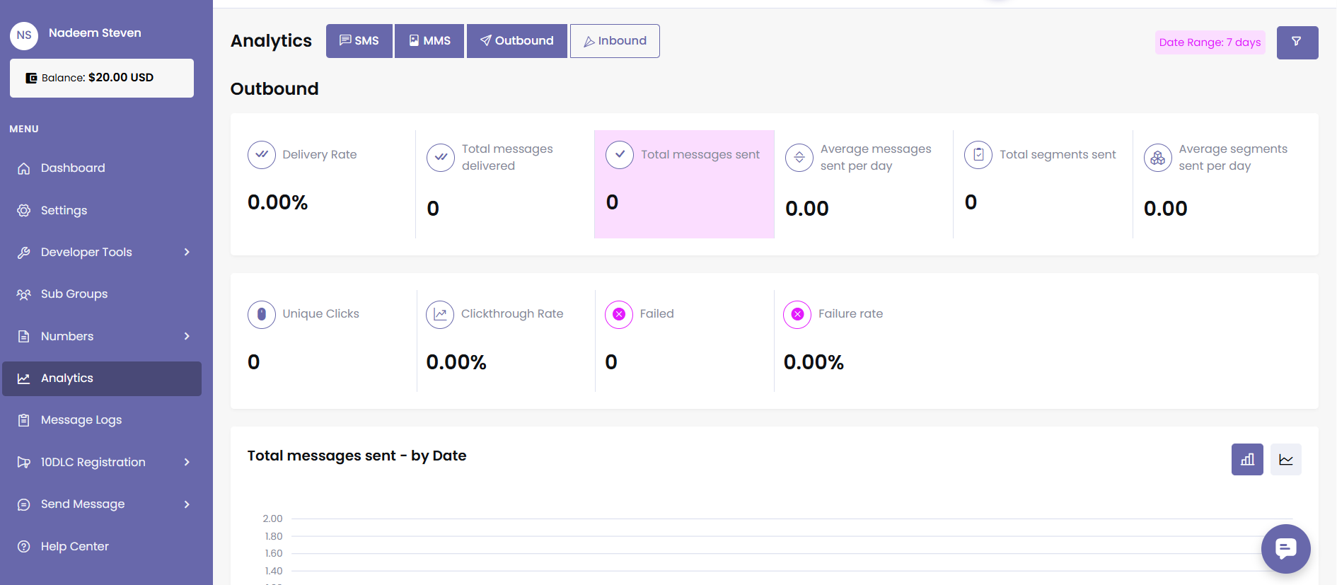
Key Metrics
At the top, you’ll see 11 summary metrics including:
Metric | Description |
|---|---|
Delivery Rate | Percentage of messages delivered successfully. |
Total Messages Sent | Number of messages sent during the selected timeframe. |
Average Messages Sent | Average number of messages sent per day in the selected range. |
Total Segments Sent | Number of message segments sent (learn more here). |
Average Segments Sent | Average segments per day. |
Total Messages Delivered | Number of total successfully delivered messages |
Failed Messages | Number of messages that failed to send. |
Failure Rate | Percentage of failed messages from the total. |
Unique Clicks | Number of unique recipients who clicked a tracked link. |
Clickthrough Rate (CTR) | Percentage of recipients who clicked at least one link in the message. |
Advanced Filtering:
Signal House’s filters allow you to get ultra-granular insights. You can filter by:
Brand
Campaign
SubGroup
Individual Phone Numbers
Tags
Message Direction (Inbound / Outbound)
Message Type (SMS / MMS)
Status (Delivered, Failed, Sent)
Timeframes:
24 hours
7 days
30 days
120 days
Custom Range
Once applied, filters appear in the upper-right of the screen.
Example:
Filter by Brand “ABC Inc.” → Campaign “Renewal Reminders” → 7 Days → View “Delivery Rate” → Result: daily delivery trend + number-by-number performance.
When a filter is applied, it’s visible in the top-right hand corner of your screen:
This will then display the data associated with that query for each of the visible graphs.
Meaning, if you filter for a specific campaign within a specific SubGroup, select “7 days,” and choose “Delivery Rate,” the first chart will show the total delivery rate for that campaign on the first graph, while the second will show the delivery rate for each number:
Example:
Pro Tips
Hover over any data point for exact values.
You can export analytics logs if needed for offline analysis.
Metrics auto-refresh on filter changes—no need to hit submit.
📬 Need Help?
Here’s a quick Loom to walk you through everything—how to navigate each section, apply filters, and understand your analytics at a glance.
https://www.loom.com/share/708b7858a8924f1993f2bf893f638ade
Still have questions? We’ve got answers.
Reach our Support Team.